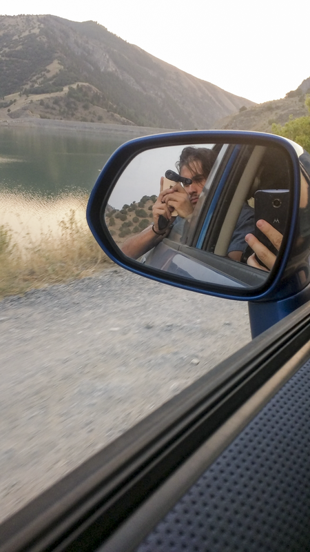
Exhibit #1

|
|
Change Log: Most of the changes I made to this photo had to do with the basic lighting and color levels. I slightly increased the exposure, contrast, and shadow levels. However, I also decreased the white levels in the photo to aid in making the sky less washed out. I also increased the sharpness of the photo to add more detail in the fine parts of the image. The final notable change I made was slightly increase the level of vibrance and decrease the amount of saturation on the photo.
The goal was to brighten and sharpen the image, I like like through Camera Raw I was able to do just that.
The goal was to brighten and sharpen the image, I like like through Camera Raw I was able to do just that.
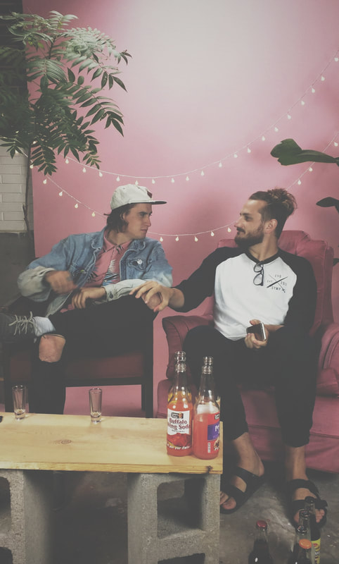
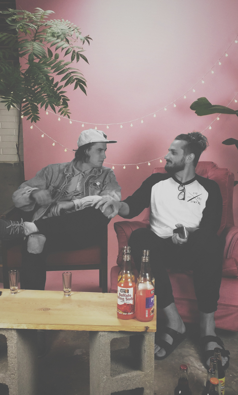
Exhibit #2
|
|
Description: This is a picture of my good friend and myself as we were filming a video for his successful YouTube channel. I really like this image because the pink chair and backdrop really pop! So, I thought it would be fun to make the pink pop a bit more by removing the color of my friend and I. I used the Quick Selection Tool to select us, then I fine-tuned my selection by using the Quick Mask Option and Brush Tool. Finally I added Black and White Adjustment Layer to my selection to remove the color.
Exhibit #3: USU Stars Digital Display
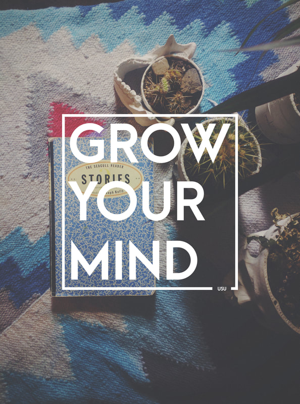
Design Thoughts: For this piece I decided to contrast large, block text with a soft image. I first opened the image in Camera Raw and decreased its exposure and contrast. Then, I decreased the saturation and increases the white balance to give the image a more "washed out" look. I contrasted the image with white text and a border. I chose the phrase "Grow Your Mind" to complement the skull pots in the image.
Exhibit #4
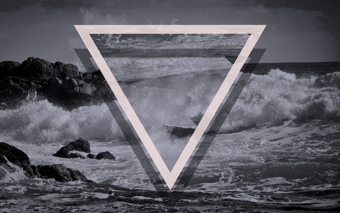
Description: For this piece I really wanted to experiment with contrast, alignment, and repetition. I incorporated all of these design principles by focusing on the triangles that are located in the middle of the image. I made the white triangle contrast with the rest of the image by giving it a thick border. The white triangle and the shadow triangle align vertically and horizontally creating an element of repetition.
Photoshop skills:
Photoshop skills:
- Adjustment Layer
- Color Balance
- Layer Mask
- Layer Effects
Exhibit #5

Design Thoughts: I wanted to keep this poster as minimal and clean as possible. I wanted the focal points to only be the face icon with the light bulb and the title of the event. Everything else I wanted to compliment the focal points. I used a lot of clipping masks in this piece to manipulate the different graphics I used (mainly their colors). I center aligned everything in order to give it a more "list-like" feel.
Exhibit #6
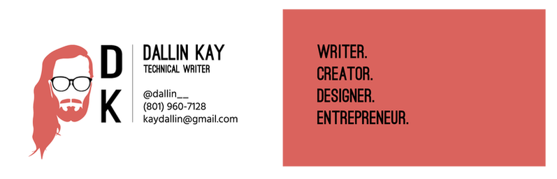
Description My business card is meant to be clean and contrasting. I only used three colors throughout the entire design which gives it a minimal, clean aesthetic. The challenging part was getting the three colors to contrast with one another without becoming too repetitive. The best way I found to do this was to change the background color on each side. Doing so gave each side a completely different look while staying within the branding walls I set up to stay uniform.
Exhibit #7
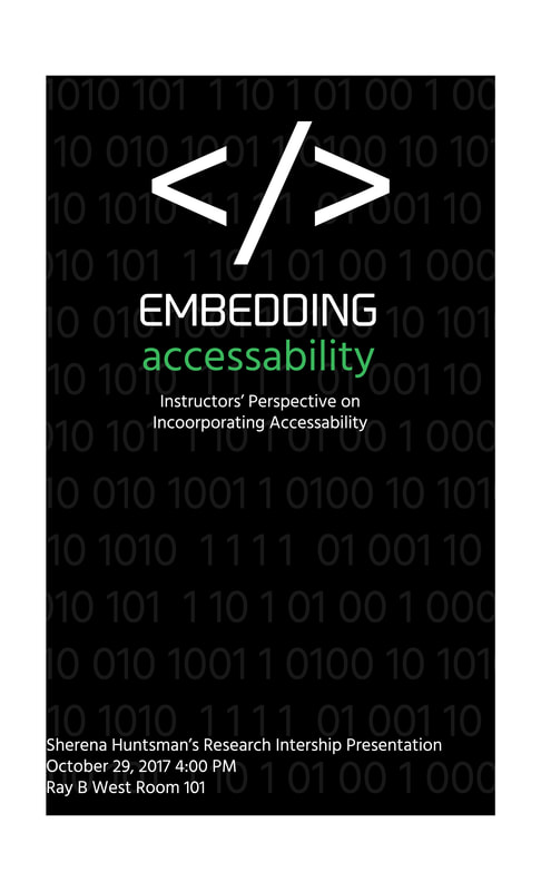
Description: This is a flyer design for a PhD student at Utah State University. She was giving a presentation on her thesis which was about technological accessibility in the classroom. For this piece, I played around with using text as the primary design element. I used different fonts, colors, and alignments to create all the visuals.
Exhibit #8
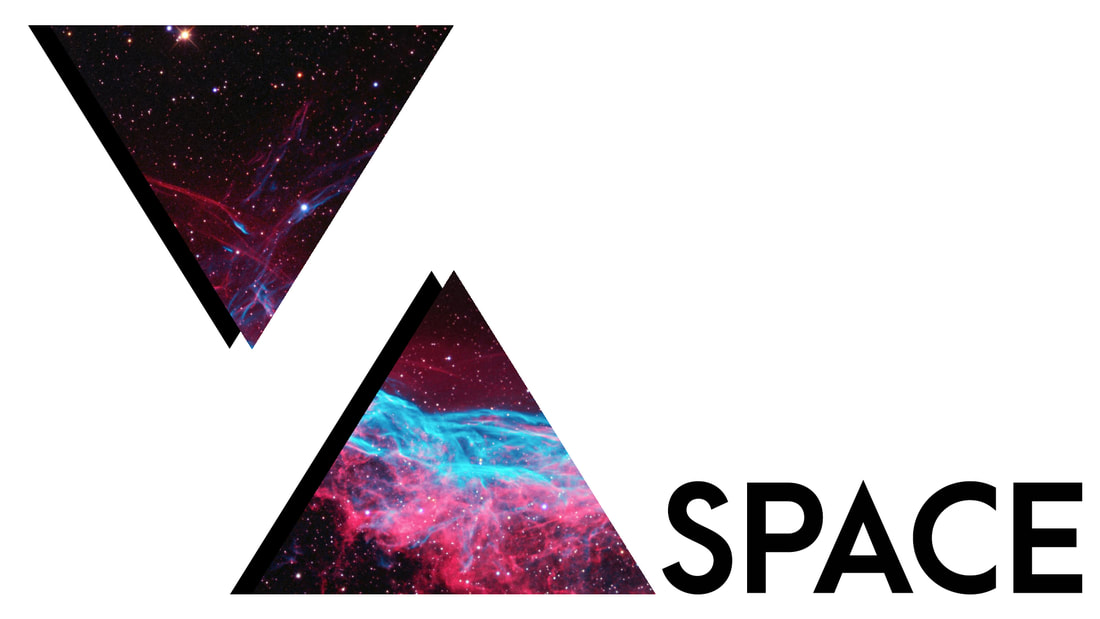
Description: For this design I wanted the focus to be on the triangles. So, I made the background white and the various design elements to a minimum. I added pop to the triangles by pasting an image of space in them to seem as if there is something going in within the triangles.
Exhibit #9
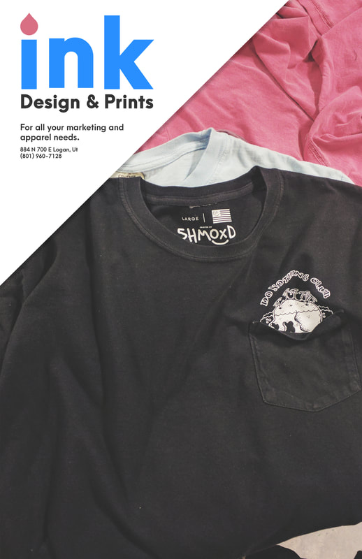
Description This flyer was designed to be easy on the eyes and quick to view. Especially on the background image, the colors I chose for the t-shirts are all soft, yet they contrast well with each other. I wanted the attention of the viewer to be directed to the top left corner of the flyer where the company logo and information are. The colors on the information section are still rather muted, but they have more pop than those in the background image. Again, I designed them that way in order to grab the attention of the viewer. The colors in the logo align with the t-shirt colors in the background image. I used the eyedropper tool in Photoshop to pull out the t-shirt colors and then increased their vibrancy and saturation jut a tad to add more contrast, then used them in the logo.
Exhibit #10

Description I wanted the focal point of this piece to be on the header which reads "Hurry!" The large contrasting letters grab the attention of the viewer and pull them in. I wanted the rest of the design to be fairly simple. I used the Type tool in Photoshop to create two text boxes that simply outline the information of the advertisement. I aligned the text boxes with one another to add balance and symmetry. The colors in the advertisement are uniform and modest, except for the the header. I intentionally used a darker, stronger font on the header to add more contrast.
Exhibit #11
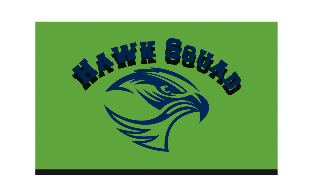
Description The style I created in Photoshop is meant to vaguely resemble a mesh jersey since the image is meant for a high school sports fan. I added a pattern effect to the style which repeated throughout each element of the image. I also wanted to add a hint of 3D to the image so I added a heavy drop shadow behind the banner style lettering.
